Do you gays think this is a good idea?
I Am Thinking Of Redoing My Kitchen In "Angel Gabriel Blue"
| by Anonymous | reply 16 | June 11, 2021 5:49 PM |
OP your post is useless without pics.
| by Anonymous | reply 1 | June 9, 2021 2:58 PM |
Only if you wear wings while you wash dishes OP.
| by Anonymous | reply 2 | June 9, 2021 2:59 PM |
Consult the Vicar
| by Anonymous | reply 3 | June 9, 2021 3:00 PM |
OP is Delia Wheelwright who stole my response to the other kitchen thread. People who pretend to be original and superior on here make it so much more difficult for those of us who really are.
| by Anonymous | reply 4 | June 9, 2021 3:01 PM |
You may become so relaxed that you fall headfirst into your soup . . . and DROWN!!!!
| by Anonymous | reply 5 | June 9, 2021 3:02 PM |
r3
She made the vicar take off his shoes
| by Anonymous | reply 6 | June 9, 2021 8:50 PM |
r4
I'll teach her to call my kiwifruit "lower middle class"
| by Anonymous | reply 7 | June 11, 2021 3:23 PM |
I did mine last year in Hyper Blue. And my kitchen recently was profiled in my local paper in an article about the emergence of blue in home decorations.
| by Anonymous | reply 8 | June 11, 2021 3:41 PM |
Blue? In a house?
| by Anonymous | reply 9 | June 11, 2021 3:43 PM |
R8, I’d love to see it if you have a picture.
| by Anonymous | reply 10 | June 11, 2021 3:54 PM |
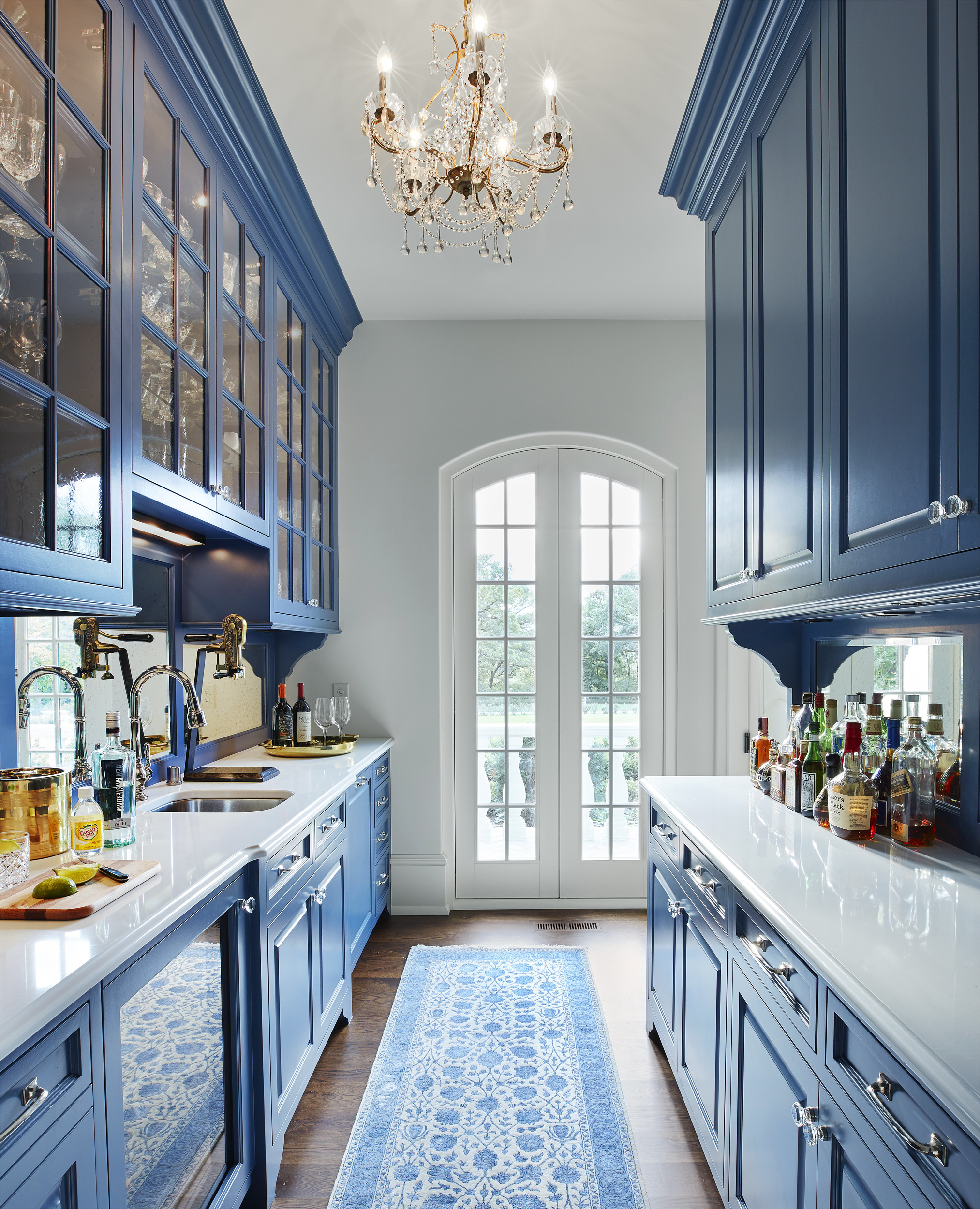
R10, the color is similar to the "Colored Cabinetry" shown here.
| by Anonymous | reply 11 | June 11, 2021 4:05 PM |
OP, I’m afraid you’ll aim for Angel Gabriel Blue and settle for cornflower blue. It’s two short steps to wooden ducks with ribbons around their necks, sincere ceiling border paper, and naked pine occasional tables.
Soon, you’ll hang “stained glass” figurines in your window via suction cups.
I can sense the decay of your reproductive system from here.
| by Anonymous | reply 12 | June 11, 2021 4:16 PM |
Will the ceiling and cabinet doors be adorned with frescoes & gilded cherub statuary?
OP = Liberace From Beyond The Grave
| by Anonymous | reply 13 | June 11, 2021 4:40 PM |
R11, I had French blue kitchen cabinets in one place, and delft wallpaper and dishes in another (I know, I know). The French blue cabinets I liked and could have lived with a while longer. The delft was too busy after a while. I even got rid of the dishes after a while. I really liked them for a while, but suddenly I was just sick of them and gave them away.
There’s an interior decorator, Maria Killiam, who talks about this a lot. Basically, she says keep it plain when it comes to fixed surfaces in the house, because you’ll get sick of it or it will go out of style. At first I thought that was boring and awful, but I kept reading her columns showing examples and she converted me somewhat. What she would say is, keep the fixed surfaces pretty solid colored, then add color with painted walls or pictures or things you can change out or paint over.
I think the reason I liked the French blue better is, it’s a color that goes with a lot of other colors, so you can bring the intensity up or down. And I’m a person that likes bright colors. It was this color, but shaker style, not so country looking. And no patterns. I would never pick this for myself, but it was nice.
I’ve seen deep olive greens or other greens work well in a kitchen too.
| by Anonymous | reply 14 | June 11, 2021 5:18 PM |
R14 The blue you show here is elegant. It is greyed. down. The color palate is limited, the whole effect is neutral .
The blue at R11 is garish in comparison.
| by Anonymous | reply 15 | June 11, 2021 5:28 PM |
Here’s a greyed down green that would be nice with earth tones or even some brights.
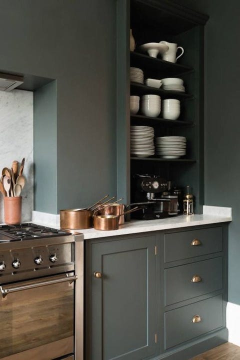
| by Anonymous | reply 16 | June 11, 2021 5:49 PM |