Film experts: Help me pinpoint/define what it is I notice in this one era of cinema
Very specifically, the late 70's -early 80's. I would even define it as from 1977 to 1983, with some exceptions from the earlier 70's. A very specific time period.
During this time, I find many movies have an organic, almost decaying warmth to them. Like a soft, tan glow with well defined lines (but not too high contrast, crisp like earlier color films from the 60's).
Was it the film commonly used at the time? Camera technology? Lighting trends? Specific people working in the industry who preferred a "natural light" type of look for films? All of these things combined with the "grown-up hippy" fashion and interior design trends of the time, that favored more natural toned clothing and interior color schemes? All of these things touched by the American Bi-Centennial Georgian revival trends of the late 70's, that would be "modern" for that period? And this is not just some distant nostalgia I hold, since this was a little before my time.
Do you know what it is? Here are some films I'm thinking about for reference:
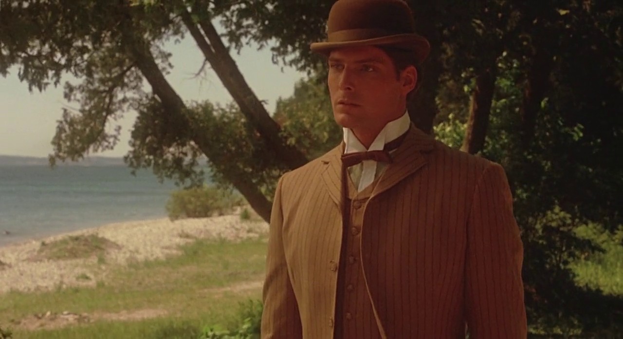
"The French Lieutenant's Woman" (1981) "Interiors" (1978) "Rich Kids" (1979) "Picnic at Hanging Rock" (1975) (I know gauze was used some times during the filming of this to give a dreamy look) "The Draughtman's Contract" (1982) "Mon Oncle Antoine" (1971) "Fanny and Alexander" (1982) "A Midsummer Night's Sex Comedy" (1982)
| by Anonymous | reply 134 | December 2, 2018 5:32 PM
|
You can include Heaven's Gate in that as well
| by Anonymous | reply 2 | December 1, 2018 1:44 PM
|
I think the Coen Brothers tried to capture this aesthetic in No Country for Old Men (which takes place in 1980)
| by Anonymous | reply 4 | December 1, 2018 1:46 PM
|
R3 Thank you! I've noticed many of my favorite movies are from within this distinct window of time in cinema and there's some elusive combination of things about them that's appealing to me. I'm trying to put my finger on what, exactly, it is.
| by Anonymous | reply 6 | December 1, 2018 1:50 PM
|
r2 Yes, it's almost like modernized sepia.
| by Anonymous | reply 7 | December 1, 2018 1:51 PM
|
OP, I definitely notice it too! But I don't know what caused that particular aesthetic.
I was born in the early 1980s. In family photos from that period, I've noticed the same phenomenon.
| by Anonymous | reply 8 | December 1, 2018 1:51 PM
|
The chemistry that went into the film stock (Fuji always managed much nicer cool greens and blues while Kodak skewed sepia), filters, and post production correction to go for that sepia toned golden Kodak color, all combined for the look.
A LOT of post production also was required to balance the color/grain/contrast issues that would come up depending on variations associated with variables in lighting. But choosing the right film stock to begin with was a first step.
| by Anonymous | reply 9 | December 1, 2018 1:54 PM
|
Gordon Willis, cinematographer of Godfather I and II. Coppola apparently didn't like Willis, but was unable to recreate the look without him, so he used him again for II.
| by Anonymous | reply 10 | December 1, 2018 1:56 PM
|
R8 It's really fascinating because it conjures up such a feeling for me. This quality is its own kind of ambiance.
R9 Thank you! That's the kind of information I was hoping for.
| by Anonymous | reply 12 | December 1, 2018 1:57 PM
|
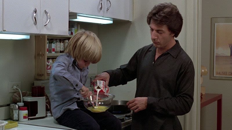
R11 So funny because I was going to add "Kramer vs. Kramer" but forgot to. I just love the look of these films. Even "The Shining" (1980) has a slightly cozy feel to it because it shares this quality!
R10 Thank you! More helpful info.
| by Anonymous | reply 13 | December 1, 2018 2:00 PM
|
"The Stepford Wives" (1975)
| by Anonymous | reply 14 | December 1, 2018 2:01 PM
|
I frankly find the look of films in the1960s through late 1970s so much more attractive than what we have now. Everything now is grey and dimly lit.
| by Anonymous | reply 15 | December 1, 2018 2:04 PM
|
R15 Agreed. Everything is so harsh and artificial looking. Even the tv shows, with the more limited technology of the time, had this organic feeling to them. "To the Manor Born" (started in 1979):
| by Anonymous | reply 18 | December 1, 2018 2:10 PM
|
Very organic, natural tones.
| by Anonymous | reply 19 | December 1, 2018 2:14 PM
|
R18 "...artificial looking [now.]..."
| by Anonymous | reply 20 | December 1, 2018 2:15 PM
|
George Lucas said that he very specifically went with brown tones in Star wars because the film that was being used in the 70s was so prone to decay, but I honestly don't know if that look that you're talking about, where it looks like everything is basically earth tones through a light Vaseline lens, is because the film stock didn't last or because studios chose visuals that would look okay when the film stock eventually inevitably degraded.
The earliest example of what you're talking about that I can think of is McCabe and Mrs. Miller.
| by Anonymous | reply 22 | December 1, 2018 2:16 PM
|
Thank you r22, you've articulated the film look I'm trying to describe. I'd wondered if it had anything to do with considerations about film aging, yellowing.
"On Golden Pond" (1981)
| by Anonymous | reply 23 | December 1, 2018 2:20 PM
|
Even "Barry Lyndon" (1975) had it:
| by Anonymous | reply 24 | December 1, 2018 2:22 PM
|
And even in films with cooler toned scenes, this noticeable quality was still present. It was like aged/tarnished silver and grays, in addition to golds and tans.
| by Anonymous | reply 25 | December 1, 2018 2:23 PM
|
It's almost like an overcast, rainy day feeling to the colors.
| by Anonymous | reply 26 | December 1, 2018 2:24 PM
|
I think Barry Lyndon is a special case. Most of the movie was shot without the use of artificial light, and the indoor nighttime scenes relied only on candlelight. (Kubrick wanted scenes to look like Hogarth paintings.)
| by Anonymous | reply 27 | December 1, 2018 2:26 PM
|
R27 I agree that the lighting in "Barry Lyndon" was laboriously intentional but it still also shares that same feeling to the final images as these other films, same quality of the tones. I even see it in "A Christmas Story" (1983):
| by Anonymous | reply 28 | December 1, 2018 2:29 PM
|
Film makers switched from Technicolor to Eastman color. Technicolor provided the warm saturated color look that Eastman lacked. Grittiness was "In" by the 70s, and Eastman was more suitable for that style.
One of the few 70s movies I can remember that had the technicolor look was "Suspiria," but that wasn't a Hollywood production.
| by Anonymous | reply 29 | December 1, 2018 2:32 PM
|
I would even bookend this time period around "A Company of Wolves" (1984). 1984/1985 is when you really notice something starting to change.
| by Anonymous | reply 31 | December 1, 2018 2:37 PM
|
"Clash of The Titans" (1981)
| by Anonymous | reply 32 | December 1, 2018 2:38 PM
|
Thank you R29! Very helpful information.
| by Anonymous | reply 33 | December 1, 2018 2:39 PM
|
Even "Superman" (1978) with its bright costume colors had something of this feel to it:
| by Anonymous | reply 34 | December 1, 2018 2:44 PM
|
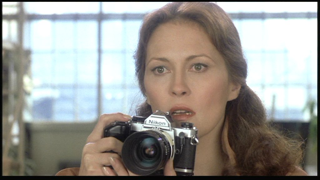
'Eyes of Laura Mars' (1978)
| by Anonymous | reply 37 | December 1, 2018 2:51 PM
|
Now that I think about it, there are movies from 1969 with this aesthetic, like Butch Cassidy and the Sundance Kid and Midnight Cowboy. Those were probably deliberate to evoke an old-timey Western feel.
Also some in 1968: Funny Girl, The Lion in Winter, Yours Mine and Ours. Huh, wonder how far back this goes?
| by Anonymous | reply 38 | December 1, 2018 2:52 PM
|
'Ordinary People' (1980) really personifies this phenomena coupled with the autumnal color palette throughout the entire film that gives it that distant warmth feeling like looking at an old photograph.
| by Anonymous | reply 39 | December 1, 2018 2:55 PM
|
Buck would have never shot with an autumn color pallate!
| by Anonymous | reply 40 | December 1, 2018 3:01 PM
|
It isn't artificial VS organic in a way that can not be recaptured. The default absolute black is just a warm brown.
Part of the look is also based on the cinematographer's love for the 'golden hour' when natural light from the setting (or rising) sun can actually light faces directly. The actual color of the light shifts to sunset gold hues (compared to the blue light of mid-day) because of the filtering effect of the atmosphere. The golden hour is also exaggerated in LA - because the atmosphere is dry with plenty of filtering smog. Rather than being a rare and beautiful (and seasonal) event the way it is in NYC the golden hour of good natural light is quite consistent in LA. A desire to recreate the color palette that goes with the naturally filtered light of the golden hour is associated with an affinity for letting sunset/autumn be the default mood of a piece as a way to cheat the use of the effect. Even if you only get a couple of hours at best when the natural light HAS that warmth it is worth the effort made by the costume and set designers and your cinematographer to make sure interiors and mid-day exteriors line up with that color scheme.
The James Bond cinematographer was one of the few (if not the only) guy who used filters on light sources like a theatrical lighting designer rather than filtered lens options for the camera -- which did work very well with the fact those films were shot in glamorous natural settings with more to offer in terms of light color than a dim slog through the day waiting for the golden hour to hit.
| by Anonymous | reply 41 | December 1, 2018 3:01 PM
|
So true R39. A hazy, earthy feeling to the look of the whole film.
Even the greens had this earthy quality to them. This included cool greens, as well. The cool tones had this dreamy, bluish overlay/glow; warm tones were earthy and golden.
Thank you so much for that, R41. It makes sense. Humans have this innate, emotional intensity, this particular feeling of tenderness at these times of day and I'm sure the lighting has so much to do with it. The day beginning; the day ending and the feeling of spiritual contemplation and wistfulness that can accompany it.
| by Anonymous | reply 42 | December 1, 2018 3:06 PM
|
I know apple greens, mauve, taupe, tan, clay, terracotta, mustard, russet, sepia and grayed purples were popular fashion colors for that particular time period, so that can influence wardrobe palette, as well. But even cooler, brighter tones were picked up in a dreamier way on film in the late 70's, early 80's.
| by Anonymous | reply 44 | December 1, 2018 3:20 PM
|
[quote]Also some in 1968: Funny Girl, The Lion in Winter, Yours Mine and Ours. Huh, wonder how far back this goes?
The era of black and white
| by Anonymous | reply 45 | December 1, 2018 3:20 PM
|
I think the color trends of the decade also influenced what you notice about the films OP. Each decade has its own color composition that you only really notice after the fact. Of course, designers and others in the field make conscious and sub-conscious choices that guide the look. The Pantone company is one of those major influencers.
| by Anonymous | reply 47 | December 1, 2018 3:25 PM
|
R47 That's true, certainly 1995 did not look the same as 1981 onscreen. But what's interesting from this time period is how even bright and cool colors seem earthier more organic. "Annie " 1982:
| by Anonymous | reply 48 | December 1, 2018 3:28 PM
|
Terrence Malick filmed Days of Heaven during the magic hour / dusk to get that look.
I remember reading that with film, yellow fades first and yellow governs contrast. No idea if that is relevant but it came to mind.
| by Anonymous | reply 49 | December 1, 2018 3:29 PM
|
Warm golds and browns are associated with autumn and the filtered light of sunsets. But colors also tend to fade to brown over time -- especially 'chemical' pigments.
So there is also that to consider. Photos and printed materials have a tendency to fade to brown over time. By the 70s sepia toned and nostalgia was already a part of the visual vernacular.
| by Anonymous | reply 50 | December 1, 2018 3:31 PM
|
Before Night Falls is a visually stunning movie.
| by Anonymous | reply 51 | December 1, 2018 3:40 PM
|
Even later films, ones that might have been made with similar or much of the same technology, look very different. The mid 90's film aesthetic almost looks like pulp comics theme parks, compared to the films of 1982. 15 years after "The French Lieutenant's Woman" and digital touch-ups were emerging. If I'm in the mood for mid-late 90's, they're bright and fun to watch but it seems I'm always in the mood for late 70's, early 80's ones :
| by Anonymous | reply 52 | December 1, 2018 3:41 PM
|
OP some of the most prominent cinematographers of this era are responsible for this look, it was just the fashion then
Sven Nykvist (Cries and Whispers [Oscar], Autumn Sonata, Pretty Baby, Fanny and Alexander [Oscar])
Vilmos Szigmond (McCabe & Mrs Miller, Obsession, Close Encounters of the Third Kind [Oscar], Heaven’s Gate)
| by Anonymous | reply 53 | December 1, 2018 3:43 PM
|
I never watched M*A*S*H because whatever they did visually was depressing. Same with Hill St Blues. The dreary side to OP's "decaying warmth," an evocative description.
| by Anonymous | reply 54 | December 1, 2018 3:44 PM
|
Thanks, R53. I think that's a big part of it, too. Tastes of prominent creators, fashions and technology all coming together to create the look of a cinematic moment, if not era.
| by Anonymous | reply 55 | December 1, 2018 3:45 PM
|
Also Geoffrey Unsworth (Cabaret [Oscar], Murder on the Orient Express, Superman, Tess [Oscar])
| by Anonymous | reply 56 | December 1, 2018 3:45 PM
|
A modern look at selecting your color design shows how people choose color designs now.
I prefer cool highlights and warm shadows and find the over abundance of cyan in movies to be annoying. But it isn't really an issue of it seeming more organic or anything. I just find the fetishism of florescent cyan light tones to be as annoying as florescent lights themselves.
| by Anonymous | reply 57 | December 1, 2018 3:47 PM
|
And Vittorio Storaro (Last Tango in Paris, 1900, Apocalypse Now [Oscar], Reds [Oscar])
| by Anonymous | reply 58 | December 1, 2018 3:48 PM
|
R54 The funny part is, that I wholeheartedly agree with you on this! This aesthetic can quickly go from warm and cozy to looking dirty, grimy and depressing if you go too far with it and that's why I make a distinction between the late 60's/early 70's and later use of this technology, style, whatever it is.
That screen griminess works so well in a quirky, slightly black comedy film like "Harold and Maude" or adds just the right edge of a disturbing decay to "Belle du Jour" but with a gentle hand it imparts organic warmth. It's slightly creepy in "Belle du Jour" and that's not just considering the subject matter. There's something harsher about the visuals. What changed?
| by Anonymous | reply 59 | December 1, 2018 3:52 PM
|
A nice selection of color schemes over the years.
| by Anonymous | reply 60 | December 1, 2018 3:55 PM
|
Thank you r60! Very interesting.
| by Anonymous | reply 61 | December 1, 2018 3:56 PM
|
It's harsher here in "Harold and Maude".
| by Anonymous | reply 62 | December 1, 2018 3:58 PM
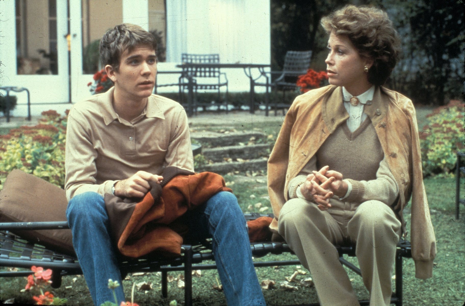
|
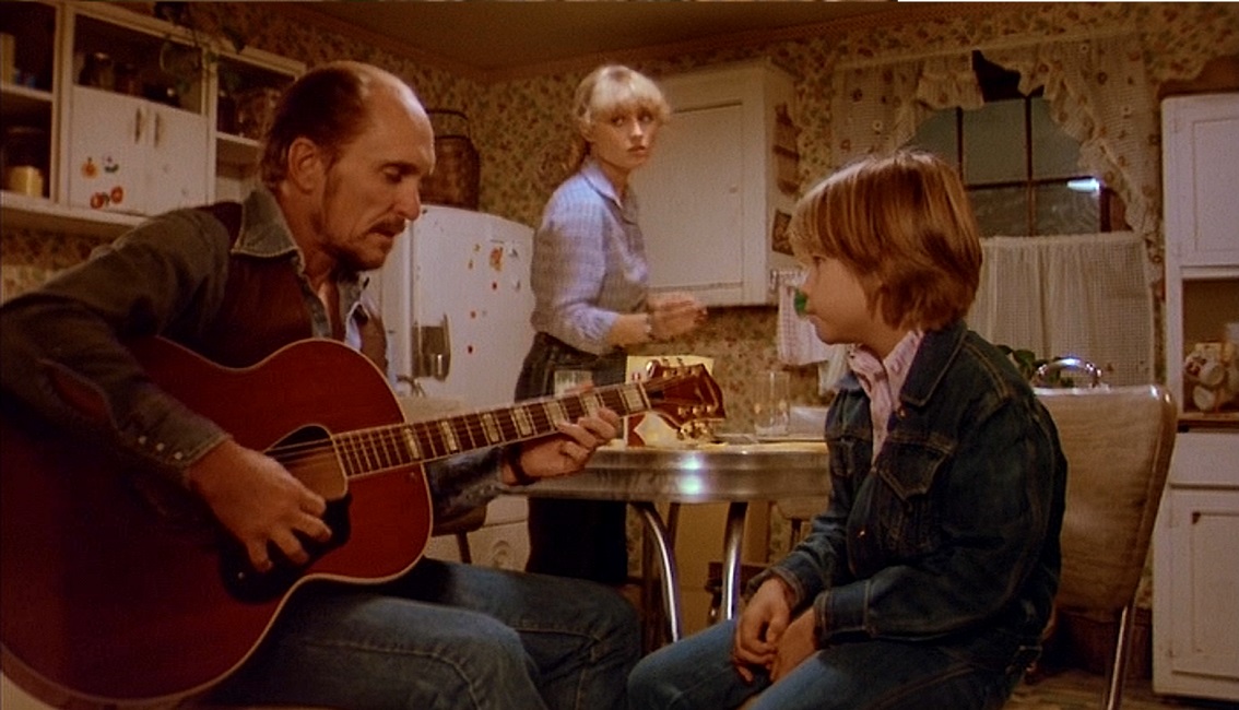
R62 By "Rich Kids" (1979), the contrast is looking like this:
| by Anonymous | reply 63 | December 1, 2018 4:00 PM
|
I would love film to return to this golden look. Now all we see is grey, monochromatic and dimly lit movies , like everything is filmed in the darkest corner of a dimly lit office. David Fincher is among the worst offenders. Even technicolor would be better than what we have now.
| by Anonymous | reply 64 | December 1, 2018 4:06 PM
|
Even "Willy Wonka and The Chocolate Factory" (1971) with its bright colors and theme, feels darker, heavier to me. And these are all films I love or appreciate but there is definitely something that changes around 1977. I don't know if it's the fashion combined with different filters and how this is captured onscreen but it's definitely a shift to a warmer and softer look, later in the decade.
I'd even say today filmmakers have moved back to that very moody and slightly psychedelic, late 60's, early 70's palette and contrast. I don't dislike it intensely, I just prefer the softer visual quality of the later portion of the 70's.
| by Anonymous | reply 65 | December 1, 2018 4:08 PM
|
Same here, R64. It would be enjoyable to sit in a movie theater again.
| by Anonymous | reply 66 | December 1, 2018 4:09 PM
|
"Death on the Nile" (1978)
| by Anonymous | reply 67 | December 1, 2018 4:20 PM
|
I enjoy the old movies in technicolor, they look like moving paintings. The surreal quality it creates helps transport me from my reality into the world of the movie. I could still appreciate it in the right movie.
| by Anonymous | reply 68 | December 1, 2018 4:21 PM
|
Even "All that Jazz" (1979), despite its flashy numbers, had that quality
| by Anonymous | reply 69 | December 1, 2018 4:22 PM
|
Harry Potter movies have it too.
| by Anonymous | reply 70 | December 1, 2018 4:24 PM
|
67 post with Dame Maggie Smith reminds me that there is a documentary with Dame Maggie, Dame Judy, Dame Joan Plowright and Dame Elaine Atkins out now called Tea With The Dames. It's basically an afternoon listening to them tell stories about their friendship, lives and work. Anyone seen it?
| by Anonymous | reply 71 | December 1, 2018 4:24 PM
|
R68 I agree, I love it for what it was. I love the aesthetic of "Gigi" because it's so specifically like a painting from that time period. It creates a very, distinct mood. But the movies that feel most like "home" for me are those from that later time period.
R70 I can see that, they did have a hint of this aesthetic. But I wonder how much of that had to do with the prep-school type set, with all the natural materials and arts and crafts style that would usually be found in what most people identify as that style reference.
| by Anonymous | reply 72 | December 1, 2018 4:26 PM
|
"Fame" (1980) had it, too.
| by Anonymous | reply 74 | December 1, 2018 4:28 PM
|
I guess at R59 and in "Harold and Maude", they're deeper colors with a cool overlay, while the later period tended towards deep or soft colors but with a warm overlay.
| by Anonymous | reply 75 | December 1, 2018 4:32 PM
|
My grandmother watched Tea with the Dames and said it was wonderful! She said I might need to be older to fully appreciate it, but I’m planning on seeing it anyway.
| by Anonymous | reply 76 | December 1, 2018 4:32 PM
|
I guess if "Gigi" (1949) the movie were a person, they'd be a "Bright Spring". Whereas the late 70's, early 80's film period was like one that wore "Soft Autumn" or "Deep Autumn" colors.
| by Anonymous | reply 77 | December 1, 2018 4:37 PM
|
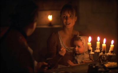
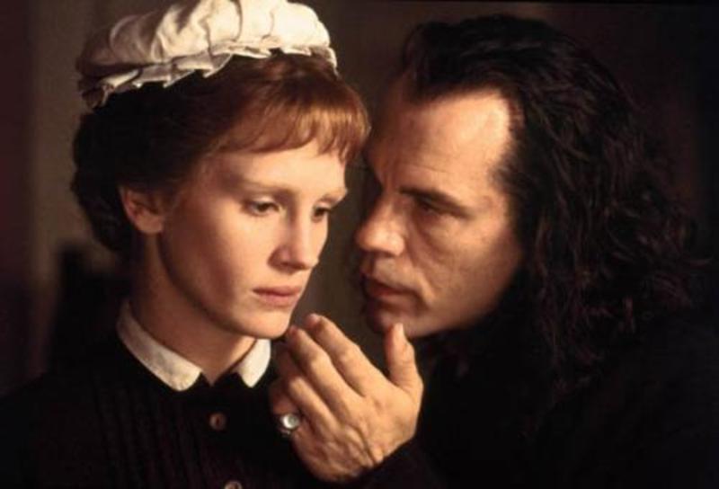
Yes, "Mary Reilly" did have a similar quality, though not so soft focused? Not so golden?
| by Anonymous | reply 82 | December 1, 2018 4:44 PM
|
The auteurs of New Hollywood rejected the artificial high-key, shot-in-studio look of previous decades in favor of warmer tones, "natural" lighting and evocative settings. Many of them hired European cinematographers who were already experimenting with naturalistic low-light styles, diffusers and fog filters in their native countries. In order to shoot in low light, the film negatives had to be push processed. Eastman Kodak came up with 100 ASA 5254 in 1968, which gave the films a softer, more pastel look. In '72, Kodak introduced stock 5247, which was supposed to be sharper, finer grained, but it went green during push-processing. They revamped it in 1976, and it became the standard film stock for the rest of the decade.
| by Anonymous | reply 83 | December 1, 2018 4:45 PM
|
Interview With A Vampire 1994. Do these early 90’s count, or was it too late by then?
| by Anonymous | reply 84 | December 1, 2018 4:46 PM
|
There's just something warmer, more subtle about that time period in film.
R83 Wow, thank you so much for this. I personally love natural light, in my homelife and when I see what looks to be or to be mimicking it in film. Which might explain my fondness for this late 70's/early 80's natural light leaning style.
| by Anonymous | reply 85 | December 1, 2018 4:46 PM
|
r72 I don't think technicolor is right for every movie but I'd like to see some of it in the fantasy genre or certain musicals done with that process. How would LA LA Land look with some (not saying the same level as old time) saturated color? It's set in Hollywood which in and of itself is supposed to be a bit unreal, the place where dreams, and films are made. (though really films are made in Georgia now) But it was shot very realistically like what we see everyday. How the fuck is that supposed to be romantic? How is that supposed to make me think about dreams coming true? Take me somewhere.
Game Of Thrones uses color brilliantly. Any places that are considered Northern with cold climate are shot in a blue palette. Any places Southern, or warmer, shot in golden tones etc. Superior filmmaking going on in that program on every level.
| by Anonymous | reply 87 | December 1, 2018 4:57 PM
|
Love that film 86.
I'll have to watch it again to see if it holds up.
| by Anonymous | reply 88 | December 1, 2018 4:59 PM
|
R84 Same idea but still more defined and moody in the 90's film. But it does capture some of that quality.
As far as later films capturing what I like in the time period I'm mentioning here, Sophia Coppola does something similar with light. I feel like she has a similar appreciation for the cinematography of that time period and is trying to capture something of that kind of feeling in her films.
R87 I now realize I respond more to cinematography in a movie than anything else, even script. All of my favorite films heavily rely on light and screen composition to create ambiance, almost at the expense of everything else. And I actually prefer them that way.
| by Anonymous | reply 89 | December 1, 2018 5:01 PM
|
R87 So important because light really is different between regions, based on many factors (including the flora of a region, the kind of trees that would grow there) and that has to be reflected in the presumed location of the scene.
| by Anonymous | reply 90 | December 1, 2018 5:06 PM
|
Also, the still at R89 doesn't have that subtle golden quality but you can see she's trying to capture something of that feeling.
| by Anonymous | reply 91 | December 1, 2018 5:07 PM
|
Speaking of this look in later films, it's captured a couple of times in the interior day scenes in "Dracula" (1992).
| by Anonymous | reply 92 | December 1, 2018 5:12 PM
|
When I moved from New York to LA one of the first friends I made was from NJ. When first out here I was often complaining about the sun and the harsh quality of the sunlight on my eyes. My friend pointed out that back East the sunlight is warmer more amber and the sunlight in LA is whiter. You would think because of pollution (I moved in 89) it would have helped filter it but not really.
| by Anonymous | reply 93 | December 1, 2018 5:14 PM
|
You are talking about analog to digital - LED lights, switch from film to digital, digital audio all of that. It is the same argument for Vinyl and CDs to DVD to digital audio - the move from tubes to circuits for audio replication - People claim there is a tangible loss of quality.
| by Anonymous | reply 95 | December 1, 2018 5:16 PM
|
r89 If you are interested the link is to a steven soderbergh's blog. He took all the color and sound (unfortunately substituting EDM) from Raiders Of The Lost Ark so that it can be viewed solely through the visuals. If you hate the EDM you can put of some music yourself or watch it silently but if you like visuals and staging then you will love this.
[quote]At some point you will say to yourself or someone THIS LOOKS AMAZING IN BLACK AND WHITE and it’s because Douglas Slocombe shot THE LAVENDER HILL MOB and the THE SERVANT and his stark, high-contrast lighting style was eye-popping regardless of medium. - S Soderbergh
Scroll down to the bottom of the page for the viewer, click the triangle in the lower left and give it a minute to boot up.
| by Anonymous | reply 96 | December 1, 2018 5:28 PM
|
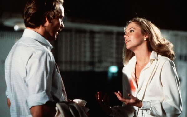
Body Heat (1981) also had the look.
| by Anonymous | reply 97 | December 1, 2018 5:30 PM
|
All of 70s Scorsese, including Taxi Driver (1976). By the time of Goodfellas (1990), the palette had changed.
| by Anonymous | reply 98 | December 1, 2018 5:31 PM
|
Foxes, made in 1980, also has the look.
| by Anonymous | reply 99 | December 1, 2018 5:33 PM
|
Another teen sepia film, Little Darlings (1980)
| by Anonymous | reply 101 | December 1, 2018 5:35 PM
|
Imagine 30 years from now on Datalounge:
Does anyone remember in the mid 2010’s, that film quality? Everything looked artificial, harsh, and either too bright or very dark? Loved that look.
| by Anonymous | reply 102 | December 1, 2018 5:43 PM
|
You really start to see a change in aesthetic in the mid-80s when the Miami Vice look came in, with all those intense blue/red/pink tones. Manhunter is a good example:
| by Anonymous | reply 103 | December 1, 2018 5:53 PM
|
Ironically, another film based on a Thomas Harris novel, Silence of the Lambs, had that sepia toned 70s/80s look, though it came out five years later than Manhunter.
| by Anonymous | reply 104 | December 1, 2018 5:54 PM
|
The love scene in Top Gun really captures the neon 80s look. Everything was suddenly like a Nagel drawing.
| by Anonymous | reply 106 | December 1, 2018 5:59 PM
|
[quote]I would love film to return to this golden look. Now all we see is grey, monochromatic and dimly lit movies , like everything is filmed in the darkest corner of a dimly lit office. David Fincher is among the worst offenders. Even technicolor would be better than what we have now.
I would love for movies to return to *film*, period! I think shooting on digital is now the norm. There are movies that are still shot on 35mm or even 16mm (Aronofsky’s ‘mother!’), but so many productions go with digital because it’s so cheap and you can do take after take after take. Fincher’s Zodiac was great, though, and it was all digital. It even used the same color palette everyone is discussing. But it definitely doesn’t have the “soft focus” look to it like some of these 70s/early 80s movies had.
This is how most movies looked when I was growing up in the 80s—I mostly watched older movies and not so much the blockbusters of the time—and to my mind, this is how all movies should look.
I complained on the Netflix thread about how the Coen brothers’ new movie for Netflix looks so awful—against their wishes, they had to shoot it on digital because that’s how their preferred cinematographer works now. Someone commented, “I hate this pretentious attitude!” or something to that effect. Then immediately after that, another DLer said, “Yes, how dare they try to make things look better!”, referring to the “better” quality of the 4K, UHD Coen Bros movie.
So this is what we’re up against.
| by Anonymous | reply 107 | December 1, 2018 6:08 PM
|
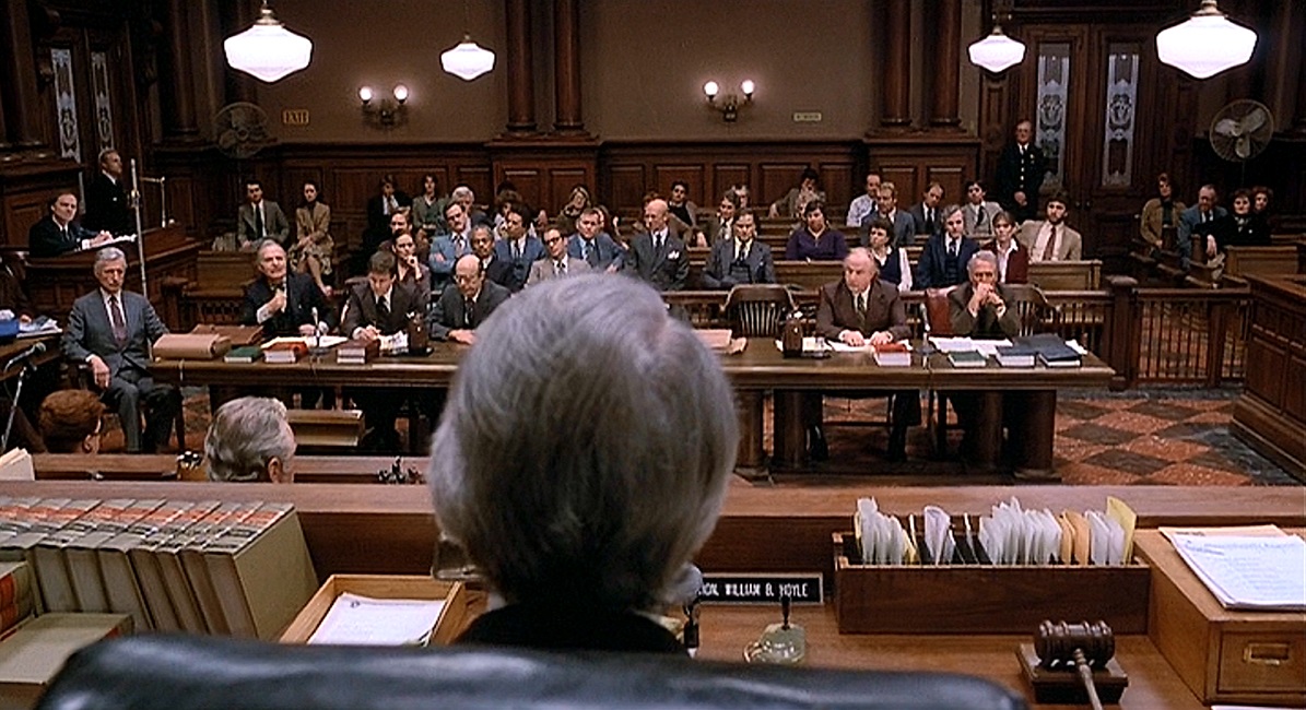
I'm remembering that in some discussion, or article, the film The Verdict (1982) was being discussed as starting a more realistic visual style in film.
I can see that but if you consider that three years later Back To The Future (1985) was released and it had some of a throw back to earlier color palettes in film.
| by Anonymous | reply 108 | December 1, 2018 6:08 PM
|
I think Back to the Future’s palette was intended to be a throwback to the Technicolor 50s because that’s when most of the action takes place in the movie.
| by Anonymous | reply 110 | December 1, 2018 6:11 PM
|
R108, that still from The Verdict reminds me of The Paper Chase (1973).
| by Anonymous | reply 111 | December 1, 2018 6:11 PM
|
It’s interesting that there were really 2 different trends in 70s cinematography: the warm, gauzy look (Brian De Palma, and others mentioned here) , and the gritty, cold, documentary feel of The Exorcist and others. I think I prefer the latter, but either one is better than what came after.
| by Anonymous | reply 112 | December 1, 2018 6:13 PM
|
True r110 and I'd advocate for more filmmakers considering what kind of film they are making and using the colors and color process that best fits the mood of the film. Not all comedies or musicals should have a bright color palette but some would be enhanced by it. Not all dramas need to be in a realistic visual style but some you would ruin without it.
| by Anonymous | reply 113 | December 1, 2018 6:26 PM
|
And despite any haze, some of these movies have incredible clarity. Like just waking up and seeing the outside after the rain. Very sharp, lots of detail, rich color. Modern movies rarely have this. You can see the textures of a face. Even HD must be doctored, because it lacks that.
| by Anonymous | reply 114 | December 1, 2018 6:27 PM
|
R114 (I don’t know if you’re the OP, sorry), do you have a regular blu ray player and a 4K TV? I had no idea how good blu rays of older movies looked until my boyfriend got us a 4K TV. I’m now absolutely addicted to buying blu rays, mostly of movies from this time period. Everything from the 70s looks incredible. (hell, even The Wizard Of Oz’s Technicolor scenes look incredibly detailed; you can see makeup and costuming details that you never could before).
| by Anonymous | reply 115 | December 1, 2018 6:33 PM
|
Thanks for the advice, r115. I’ll try that when I upgrade.
| by Anonymous | reply 116 | December 1, 2018 6:51 PM
|
If you want to see the palette of a particular image/frame of film, there are online color apps that will pull the colors for you. I can't remember any names right now but there are several.
| by Anonymous | reply 117 | December 1, 2018 9:27 PM
|
Interesting R117. Must seek that out and see if i can notice a particular combo that keeps drawing m ine. Even up to 1984, with "2010: The year we make contact", though I think of "2001: A Space odyssey" as superior, artistically, I actually more enjoy watching the sequel not made by Kubrick, for this golden visual quality it has that I'm trying to articulate.
R107 Isn't it funny when you think about people making such complaints, when the Bros. are talking about the preferred visual quality they want for their MOVIE. As in, the most vital part of the kind of art/work they're hoping to create.
It's not like making a cheaper but still useful for purpose toilet paper, the look of the film is the most vital aspect, the entire point of making the product itself. Why make a film that doesn't look the way you want it to, to drastically trim costs, when how you want the film to look IS the product? It's what will drive people to even spend money on a movie ticket?
I guess like anything else, you can make your product too cheap and then customers stop buying it.
| by Anonymous | reply 118 | December 1, 2018 9:49 PM
|
R118 "...drawing [me in.]"
| by Anonymous | reply 119 | December 1, 2018 9:50 PM
|
My Bodyguard seemed almost like a dream.
| by Anonymous | reply 120 | December 1, 2018 9:53 PM
|
That has the same quality, too! From 1980:
| by Anonymous | reply 121 | December 1, 2018 9:56 PM
|
R93 your eyes hurt in Los Angeles because of the pollution. I visited LA for the first time a few weeks ago and my eyes reacted like peak allergy season. I live in Florida so I know it wasn’t because of the rich warm sunlight. And Florida is at an even lower latitude than LA.
| by Anonymous | reply 122 | December 1, 2018 10:09 PM
|
Even the French Mon Oncle movie, "Mon oncle d'Amérique" (1980) had this feeling to it.
| by Anonymous | reply 123 | December 1, 2018 10:12 PM
|
I notice this look starting to emerge around "The Boyfriend" (1971). Some earlier 70's films are a little harsher but that's a film where I notice this quality is beginning to be drawn out or added. Even "The Great Gatsby" (1971) was leaning this way, though I still the contrasts are starker in that film than in the late 70's, early 80's.
| by Anonymous | reply 125 | December 1, 2018 10:30 PM
|
R114, just remember to turn OFF the “motion plus” setting or whatever it’s called on your picture settings when you do upgrade, or everything will look like a soap opera or a live news broadcast!
| by Anonymous | reply 126 | December 2, 2018 12:13 AM
|
Huh. I never like watching movies from the 70s-80s. I thought it was because of the fashion/hairstyles or the subject matter but now I'm wondering if it's the color(!) I love b&w films and anything up to the mid-60s.
| by Anonymous | reply 127 | December 2, 2018 12:20 AM
|
Here is a color palette generator
| by Anonymous | reply 128 | December 2, 2018 12:22 AM
|
Sven Nykvist as r53 mentioned, was one of the most influential and talented cinematographers of all time. A true artist. Great thread OP. I'm off to go watch some of the films mentioned here. Perfect evening for it.
| by Anonymous | reply 129 | December 2, 2018 12:32 AM
|
[quote] This aesthetic can quickly go from warm and cozy to looking dirty, grimy and depressing if you go too far with it
I actually like this look when depicting the decaying New York of the 70s. Some of my favorite films capture this, including DePalma, but also the wonderful ....
| by Anonymous | reply 130 | December 2, 2018 1:18 AM
|
[quote]Huh. I never like watching movies from the 70s-80s. I thought it was because of the fashion/hairstyles or the subject matter but now I'm wondering if it's the color(!) I love b&w films and anything up to the mid-60s.
Let me guess, you were born in the late 80s?
Or was it the 30s?
| by Anonymous | reply 131 | December 2, 2018 5:38 AM
|
I agree with that R130 because in those cases, that quality is a very important part of creating an accurate ambiance of a setting/place. A sense of gritty decay is relevant, it's part of the story.
| by Anonymous | reply 132 | December 2, 2018 1:17 PM
|
It’s not only movies. All my family photos from the late 70s/early 80s have an autumnal haze, too.
| by Anonymous | reply 133 | December 2, 2018 1:28 PM
|
Smog, grime and the golden hue of a sunset through vintage leaded gas particulates.
The 70s did not seem like a great time to be young until AIDS came along and suddenly we had missed the most wonderful party...
| by Anonymous | reply 134 | December 2, 2018 5:32 PM
|