Color in Design. A Nice Break from the Other Threads
Color in fashion and design. Everyone looks terrible in black sportwear and mallwear. I think color looks so cheerful. Do we have to go back to 1967 for color in clothes? Why designers afraid to use it?
Movies, too rarely use color, really use it.
I like painted walls, too, with the right colors. If you rent, some places won't let you paint the walls. And of course some people think white everywhere is chic. I think one reason people like Christmas trees because it is a chance to decorate with color.
| by Anonymous | reply 179 | August 5, 2018 7:27 AM
|
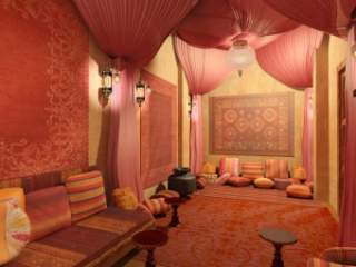
look at that deep rich kullah
| by Anonymous | reply 2 | June 27, 2017 12:03 AM
|
I did a major remodel back in 2015: new tile in the kitchen and bathroom, new cabinets, had the carpet ripped up and the floors sanded and refinished. And a total interior paint job. My contractors were a bit worried about the colors I chose: 'Key Largo' for the living room, 'Applause Please' for the dining room and hall, 'Emerald Forest' for the bathroom, 'Early Spring' for the office, 'Country Weekend' for the kitchen and 'C'est la Vie' for the bedroom. In translation, robin's egg blue for the living room, a deep grey-purple for the dining room, sea green for the kitchen, celery green for the office and lavender for the bedroom. And white trim everywhere. After all that, I had new drapes made: 'Lagoon' in real silk for the living room and dining room (a dark green-blue). So the whole house is in shades of green, blue and purple, which are the same colors I chose for my first apartment back in 1980. Yesterday, as I was drawing the curtains (the sun was still out, but my plants had gotten all the sun they needed), I looked around and thought it felt a bit like being under the ocean surface. Cool and restful, which is how I like it. Once the contractors finished their work, the head contractor admitted that he and his crew were worried that I'd regret the colors, but that they were all impressed with how well things worked out.
| by Anonymous | reply 5 | June 27, 2017 4:08 PM
|
Sounds beautiful, R5. I chose a blue, green, purple and yellow color scheme in one of the places that I lived in. I forget the exact name of the shades, but I spent a lot of time with paint samples and really thought about it - they were all nice shades - a nice green in the living room, a nice purple in the bedroom, a nice blue in the bedroom, and though I don't really like yellow, I found a nice yellow for my office and kitchen. And white trim. Added nice curtains. Like you, everyone thought it was beautiful at the end. It was!
| by Anonymous | reply 6 | June 27, 2017 4:21 PM
|
The other at the OP link has a book on blue, too. The blue is out of print. I wish they'd reprint it. He just came out with one on red.
| by Anonymous | reply 7 | June 27, 2017 4:22 PM
|
Meant "author", not "other" at R7 (lol!)
| by Anonymous | reply 10 | June 27, 2017 4:29 PM
|
Just painted my living room a zesty mid-green, which looks great with the stripped wooden floor and white cornice, architraves and wainscot.
Chose the colour to cheer me up come the long winter days - it's always spring indoors! - but the walls look very pleasing also with the summer sun beaming over them. Win win.
| by Anonymous | reply 12 | June 27, 2017 5:01 PM
|
R9 I love Bulgarian-Gypsy chic too!
| by Anonymous | reply 13 | June 27, 2017 5:09 PM
|
Not only do I hate the gray-and-beige look with the firey passion of ten thousand suns, people are dressing that way! When I go to the financial/governmental district in the city, all the office workers are wearing shades of black, gray, and beige - even navy blue seems to be considered too colorful to be "professional"!
I love color. I love to wear as much color as a guy can and to get out in colorful natural landscapes, and to sleep in my colorful green-and-gold bed! My bathroom is in deep blues and greens, not this exactly but I like the picture.
| by Anonymous | reply 14 | June 27, 2017 6:38 PM
|
I had a blue bathroom and it looked great.
Same with cars. Now they not only lack artistry in design, but everyone is buying grey ones.
| by Anonymous | reply 15 | June 27, 2017 6:45 PM
|
I'm stuck with beige walls and cheap tan wall-to-wall in an overpriced (due to in-town location) 1980s cookie cutter apartment complex. Sigh. At least my furniture is colorful.
| by Anonymous | reply 16 | June 27, 2017 6:54 PM
|
Yes, try where you can. I am stuck in an all-white apartment at the moment. But am dreaming of color.
| by Anonymous | reply 17 | June 27, 2017 6:59 PM
|
Get some area rugs, R16. That's the only thing to do with neutral carpets - cover them up.
| by Anonymous | reply 18 | June 27, 2017 7:00 PM
|
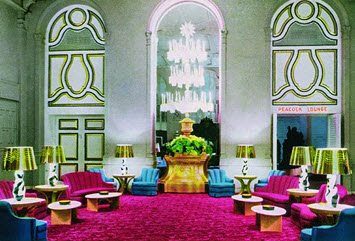
I love the dark greens in OP's pic and the car in r15.
| by Anonymous | reply 19 | June 27, 2017 7:01 PM
|
Color is starting to sneak back into men's evening wear.
Yea or nay?
| by Anonymous | reply 21 | June 27, 2017 7:08 PM
|
I keep waiting for the damn greige look to go out of style, and for the Modern India look to take its place.
India is all the rage again, after all!
| by Anonymous | reply 22 | June 27, 2017 7:10 PM
|
[quote]Color is starting to sneak back into men's evening wear.
The problem with men's formal wear is that it looks like a casual sport coat when it doesn't match the pants - and looks like a 1970s prom tux when it's anything but black. You could probably do a dark navy (which is essentially black).
I've always been a big fan of pattern - like herringbone - in a dark suit. A nice window pane or discreet paisley might also be nice.
| by Anonymous | reply 24 | June 27, 2017 7:17 PM
|
Why not a pop of Venetian Red?
| by Anonymous | reply 26 | June 27, 2017 7:25 PM
|
I was thinking a darker (and not tweed) version of this for pattern:
| by Anonymous | reply 29 | June 27, 2017 7:41 PM
|
I don't like the hat. But he is putting color into his look!
| by Anonymous | reply 30 | June 27, 2017 7:51 PM
|
It's breathtaking, the lack of taste some of you have. Some of the rooms shown here are downright squalid.
Color is lovely.... if you know what you're doing.
| by Anonymous | reply 32 | June 27, 2017 8:40 PM
|
Well, I think some of them are jokes, R32
| by Anonymous | reply 34 | June 27, 2017 9:19 PM
|
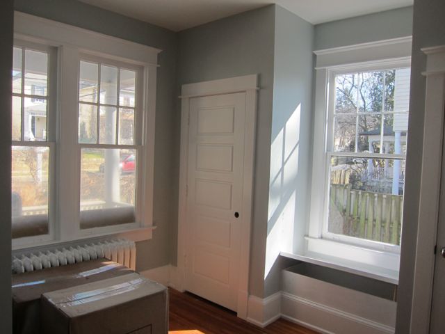
This is my living room looking through the dining room towards the kitchen. This was right after they finished refinishing the floors, and before I moved the furniture back.
| by Anonymous | reply 36 | June 27, 2017 9:52 PM
|
I get my colour inspiration from Luriddigs.
| by Anonymous | reply 41 | June 27, 2017 10:18 PM
|
R13, I googled Bulgarian gypsy.
| by Anonymous | reply 43 | June 27, 2017 10:29 PM
|
OP, color your simplistic comments gray. Simply declaring something to be true and thinking that makes it so is the colorless millennial game.
There is a tremendous amount of color in fashion, interior design and films. Not everyone likes your Mexicali Modern color sensibility. And owners of rental units naturally prefer that Bruce the Magnificent does not paint the ceilings gold, the walls purple and red, and the floors green before skipping out on the rent payment two months later. (Your name is Bruce, right?)
But to make up this attempt to talk sense into you, I'll give you the subject you REALLY should be thinking about when it comes to color in movies: the orange-and-blue trend. It's what really is wrong with color in movies for the last 20 years or so.
| by Anonymous | reply 44 | June 27, 2017 10:31 PM
|
How about color in food, too?
Here, OP. I made you some nice colorful Jell-O. I really worked on it. It's not easy to get antifreeze to set, you know.
Enjoy!
Please.
| by Anonymous | reply 45 | June 27, 2017 10:34 PM
|
R44, I only like beautiful colors and I am not "Bruce." I agree with you with your link, though. Ugh. Most movies are very uninspired with their use of color. And they copy each other a lot, in a bad way. Sad when it is a visual medium.
I liked the use of color in Marie Antoinette and The Grand Budapest Hotel (in fact, I liked the use of color in Grand Budapest more than the actual movie).
Also loved the use of color in Far From Heaven and Carol.
| by Anonymous | reply 46 | June 27, 2017 10:52 PM
|
As a teenager, I remember a book I checked out from the library, all about the design work of Robert Adam. I loved his skillful handling of a wide range of colors. I think his work inspire me not to shy away from color. I'm still hoping to find a good spot where I might add a dash of Majorelle blue.
| by Anonymous | reply 47 | June 27, 2017 11:14 PM
|
[quote]Do we have to go back to 1967 for color in clothes?
yes.
| by Anonymous | reply 49 | June 27, 2017 11:53 PM
|
These were supposed to be for Braniff airlines. Not sure if they used them.
| by Anonymous | reply 53 | June 28, 2017 12:11 AM
|
I'm sure I've posted this pic before, but color is everywhere, and nature offers the best examples. The lady who help me picked out the fabric for my drapes asked me if I wasn't concerned about the lack of warm colors in my house. I pointed out that I always had flowers in bloom: orchids in shades of purple, orange and red, and the hardwood floors were a rich light brown, and some of the mahogany furniture is a rich, deep tone of red. I lived in too many shabby apartments with off-white walls and beige industrial carpet to want to forgo color at this stage of life.
| by Anonymous | reply 54 | June 28, 2017 12:23 AM
|
beautiful color and butterflies!
| by Anonymous | reply 55 | June 28, 2017 12:26 AM
|
When I was a little gayling, I was told that dark colors on the walls make a room seem smaller. That's not true, certain dark, cool colors make a room seem larger; walls the color of the evening sky, for instance, seem to recede from the eye and make a room seem larger. Blue is literally the color of distance - really! Look at a range of distant hills or mountains, the farther away they are, the bluer they appear (except in the arctic).
At my last place, my bedroom and bathroom were this sort of color, with aqua and white accents. Deep blues are wonderfully soothing in bedrooms and bathrooms, I mean, what is more conducive to sleep than the color of the night sky? But I find deep colored walls oppressive in public rooms, or rooms with a lot of sunlight. Deep colors may look beautiful when the light hits them, but there's no substitute for a cheerfully light and sunny room.
| by Anonymous | reply 56 | June 28, 2017 3:09 AM
|
When I had a kitchen with sunlight coming from three different directions, I painted the walls a light spring green, with white cabinets and blond wood furniture. Very cheerful color scheme by day, mellow by night, and the pale green made the greenery outside the windows more noticeable.
This is not my kitchen, I used a lighter, truer green. But it's nice enough.
| by Anonymous | reply 57 | June 28, 2017 3:14 AM
|
Down With Love had great use of color.
| by Anonymous | reply 58 | June 28, 2017 3:40 AM
|
The 80s, not the 60s, were the last decade where really bright colors dominated fashions.
| by Anonymous | reply 59 | June 28, 2017 4:06 AM
|
yes thanks to new wave, the 80s had a bit of color...and that was it
| by Anonymous | reply 60 | June 28, 2017 4:12 AM
|
Am I the only one who dislikes red as an interior color?
Bright red as an interior color gets on my nerves, to me it reads as, hot, angry, aggressive, don't-let-your-guard-down. Especially hot, I live in a hot climate and it just won't do.
| by Anonymous | reply 61 | June 30, 2017 8:58 PM
|
[quote]Am I the only one who dislikes red as an interior colour?
I like it. I have it in my house - note rotary phone and pencils.
| by Anonymous | reply 62 | June 30, 2017 9:11 PM
|
I once tried orange walls, a nice medium copper-clay tone. They read as "Mexican Restaurant".
| by Anonymous | reply 63 | June 30, 2017 9:15 PM
|
I like the color red, but I don't think I'd be comfortable having a whole wall painted red. On the other hand, R62's photo really shows red being used really well. Well done, R62!
| by Anonymous | reply 64 | June 30, 2017 9:37 PM
|
Thank you, R64.
I have three walls in red and one in white. All four was too much.
| by Anonymous | reply 65 | June 30, 2017 11:00 PM
|
[quote]I used a lighter, truer green.
What is untrue about that shade of green, R57?
| by Anonymous | reply 66 | July 1, 2017 1:18 PM
|
I used to think red walls were too much but they can be nice. It depends on the shade and the rest of the decor.
| by Anonymous | reply 67 | July 1, 2017 6:49 PM
|
I think red can work really well, as long as it's given some contrast. I would never use it in a bedroom, but in a study or an office, I think it could work really well. I can appreciate a monochrome color palette, but I spent too much of my life with beige.....everything... to have it in my private life. Witness the cockgobbler's famous office.
| by Anonymous | reply 68 | July 2, 2017 12:13 AM
|
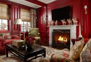
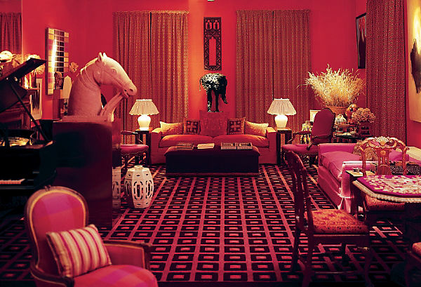
You want to see some nasty as shit red walls? This is a house near where I grew up, many years ago.
| by Anonymous | reply 69 | July 2, 2017 12:25 AM
|
Too orangey at R69 and there is a bit of mess with all the rest of the stuff. Schock"s Downton red is nicer and goes with the decor, but he should have kept his design fun at home.
And I agree no red bedroom, but it can work in an office and certain rooms with seating.
| by Anonymous | reply 70 | July 2, 2017 7:01 PM
|
That red room is a God awful shame, though because that looks like a wood paneled room.
| by Anonymous | reply 73 | July 5, 2017 1:13 PM
|
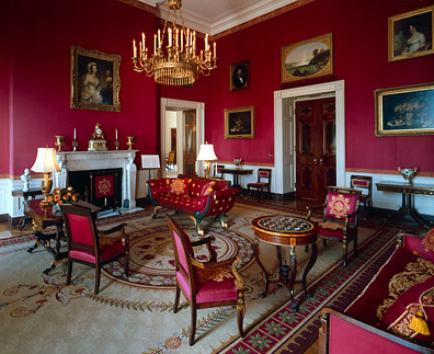
Red room at the White House
| by Anonymous | reply 75 | July 5, 2017 1:21 PM
|
You bitches are slipping.
| by Anonymous | reply 77 | July 5, 2017 2:58 PM
|
^ And so am I, it seems. Diana Vreeland's red room was my intention.
| by Anonymous | reply 78 | July 5, 2017 3:01 PM
|
Let's see if this works, R78.
| by Anonymous | reply 79 | July 5, 2017 3:41 PM
|
[quote] It's breathtaking, the lack of taste some of you have.
Mary!
| by Anonymous | reply 80 | July 5, 2017 3:51 PM
|
[quote]It's breathtaking, the lack of taste some of you have.
Don't miss the "greatest song of the '80s" thread.
| by Anonymous | reply 81 | July 5, 2017 3:58 PM
|
I like the color not red.
| by Anonymous | reply 82 | July 5, 2017 4:03 PM
|
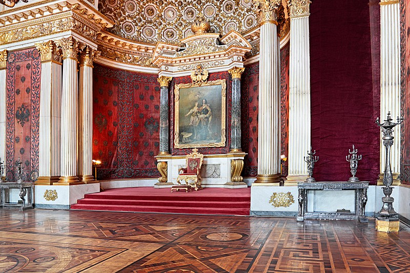
The Winter Palace boldly uses red in a number of rooms.
| by Anonymous | reply 83 | July 5, 2017 4:06 PM
|
I love color! some of us have the gift of color which is being able to see colors differently than other people can see them. Some can pick up all the undertones of a color while others just see the one color.
When I had rooms painted I would tell my clients to have their ceiling painted 3 shades lighter than the walls in the same color. They would panic when I told them that and one person came home while the painter was finishing up and said "Oh My God" and the painter said you picked it! but he misinterpreted her response. She said it was her favorite room and sometimes she would spend the day in it because as the sun moved around the room it changed the color tones including the ceiling. ALL the people that I had do this loved it!
I found that the people that just wanted white was because they were literally terrified that they might not like a color once a room was painted. I tried explaining you can paint over it and it is not like buying a house or car, it's just paint.
| by Anonymous | reply 84 | July 5, 2017 4:21 PM
|
the only red wall I've ever seen was painted anaglypta paper in a foyer in a Victorian mansion. it was gorgeous and if I hadn't seen it I would have thought it would be awful. just like food, color in moderation.
| by Anonymous | reply 85 | July 5, 2017 4:36 PM
|
I painted the anaglypta paper in my office high gloss vibrant green with gloss white trim. Furniture is medium 40's varnished wood with brass lighting from the same period. My favourite room. There is a convertible sofa and I will sleep on it if I'm working hard on a project and don't want to take that mindset to my bedroom.
| by Anonymous | reply 86 | July 5, 2017 4:55 PM
|
R86, I would LOVE to see a picture.
| by Anonymous | reply 87 | July 5, 2017 9:04 PM
|
nice use of green - Salem ads used lots of green.
| by Anonymous | reply 90 | July 5, 2017 9:33 PM
|
Still, R90, it wasn't enough to make me smoke mint-flavored cigs.
| by Anonymous | reply 91 | July 5, 2017 9:35 PM
|
I recently built a few investment units. My real estate agents advised me not to use any bold or bright colors at all because I would have a hard time leasing them out. So they are all white, beige anf grey. All were leased within two weeks of being on the market.
| by Anonymous | reply 92 | July 5, 2017 9:42 PM
|
Maybe this should be a thread of its own...
I loved the advice given by R84 about painting the ceiling three shades lighter. Tasteful friends, what other easy design tips have you found really elevate a room? I'm planning on buying my first home within the next year, and I'm so excited to decorate it. I'm hoping I can keep making upgrades (better crown molding, solid doors, etc.) in order to make it a nice, well-finished home. Any other tips or tricks of the trade?
| by Anonymous | reply 93 | July 5, 2017 10:01 PM
|
Perhaps one of the most important things to consider is to be true to the original house/apartment/dwelling. Too many incongruous renos get done every year - the mid-century farmhouse, the Victorian trimmed 60s suburban bungalow, the reclaimed everything industrial chic cookie-cutter in-fill townhouse, etc... just because people think crown moulding is an upgrade doesn't make it right in a 60s MCM classic, for example.
| by Anonymous | reply 94 | July 5, 2017 10:11 PM
|
When I was an artsy-fartsy kid, I though that green, purple, and orange was the most hideous color combination on Earth, and that nothing good could ever come of it. Then a display of Tiffany stained-glass windows came to my city, and I saw this!
It was quite breathtaking in person, and taught me that there are no bad colors or bad color combinations, just very tricky ones.
| by Anonymous | reply 95 | July 5, 2017 10:16 PM
|
R93, R94 is correct. When I remodeled my home a couple of years ago, I never forgot that I was trying to highlight its best qualities: a small, but well-built house from 1926, with lots of subtle architectural details. Beautiful hardwood floors, arched openings between many of the rooms, subtly detailed woodwork. The young lady who came to the house to help me design the new cabinets for the kitchen took lots of measurements and notes, and we talked back and forth about what I was looking for. When I explained that my parish church, built the same year as my house, was in Spanish Mission style, she just said, "Yes, yes, I love Mission style! I think I can help you now!". And she did. She included all sorts of subtle details that harmonized with the original architecture. My new cabinets are in maple, floor to ceiling (11 ft ceilings) with moldings that complement the original moldings. Give your home a hard look, and look for its best qualities, and emphasize them. I grew up in this house, so I always had ideas of how nice it might be.
| by Anonymous | reply 96 | July 5, 2017 10:34 PM
|
I agree completely with your thoughts about staying true to the original character of the house. It pains me to see renovations in old houses that have been poorly executed. In older homes, I feel almost like the house "speaks" to you and tell you what it needs to maintain its harmony.
Unfortunately, the suburb in which I live does not have many established neighborhoods. (There is a small but gorgeous downtown historic district and when the time comes to buy if I can find a house that needs work there I would be so lucky! Many of the houses in that area have already been redone and are $$$) The other neighborhoods here contain houses have been built in the past 25-or-so years and seem so sad and cookie-cutter. I dread having to settle for a builders grade, soulless house, however if I can find one with good bones (and trees... I'm not moving somewhere without trees!) I figure it will still be a good investment and better than renting. I guess I feel like my major question is how do you give a house with no character some character?
| by Anonymous | reply 97 | July 5, 2017 10:40 PM
|
R96 Your house sounds like an absolute dream. I love mission style! Thank you for your words of wisdom! Your kitchen sounds gorgeous and well done.
| by Anonymous | reply 98 | July 5, 2017 10:41 PM
|
I think wall colors and curtains are important.
| by Anonymous | reply 99 | July 5, 2017 10:49 PM
|
R5, your house sounds like a Mexican restaurant
| by Anonymous | reply 100 | July 5, 2017 10:53 PM
|
You can read this book.
My strongest advice is to have many light sources in every room. And NONE of them can ever ever be recessed lighting.
| by Anonymous | reply 101 | July 5, 2017 10:56 PM
|
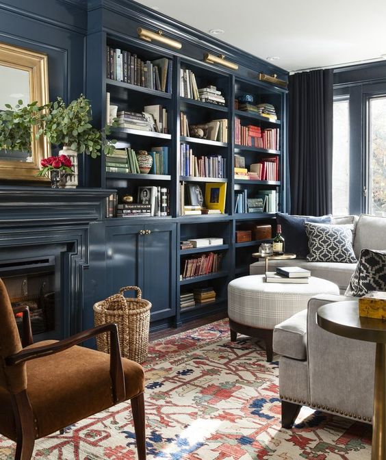
R35 I will kill for that library.
R56. Really like the grayish blue there.
When i bought my current home it was like the Golden Girls died in it: it was all hues of beige. Yellowish beige, purple beige, pink beige, whitish beige. Every single wall is beige. We have to completely redo the paint job, so we chose to do high-contrast: two walls of each room is a dark color paired with white on the other two. It transformed the entire house from death-by-Boca to something just modern enough to live with.
| by Anonymous | reply 106 | July 6, 2017 1:33 AM
|
Dark rich colors can work, if you have enough lighter elements and some shiny finishes (brass/gold tones and dark dark blue is always a good combo). Not sure this room would look larger if that was all painted "Revere Pewter".
| by Anonymous | reply 107 | July 6, 2017 4:16 AM
|
Notice that the attractive bold colored rooms shown in the photos here are all in rooms with impressive architecture, intricate woodwork and important furniture. Most people don't live that way.
A standard flat walled American cookie-cutter room devoid of architectural interest usually winds up looking squalid in bright colors. Like a Mexican restaurant or a kindergarten.
Imagine an average suburban living room painted in the dark blue at R107... it would look awful. The room shown works because it was decorated by someone who knows exactly what they're doing. Every element in the room has been carefully considered. And it was achieved with a budget most people simply don't have.
| by Anonymous | reply 108 | July 6, 2017 8:17 AM
|
David Hicks was a very fashionable interior designer in 60s London.
| by Anonymous | reply 109 | July 6, 2017 12:02 PM
|
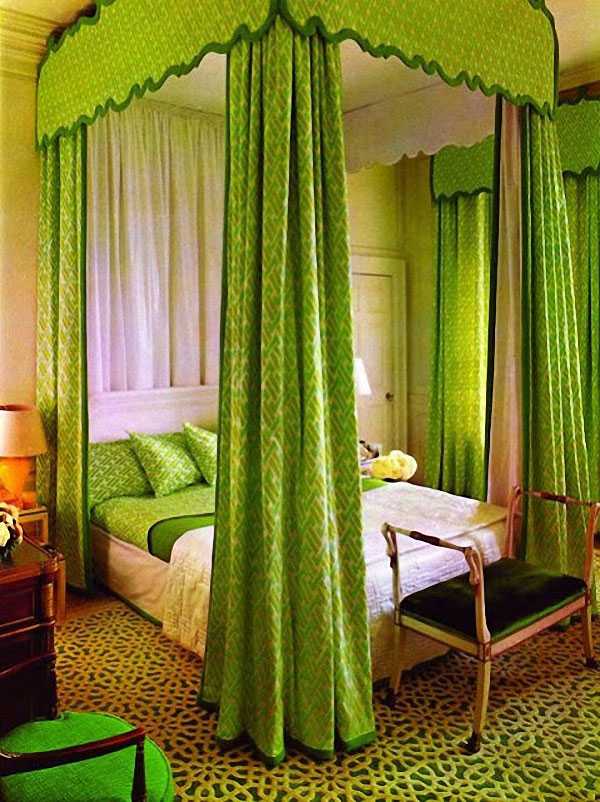
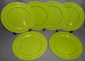
DAVID HICKS again.
Lime green is not a colour you see a lot of today in interior decoration.
(apart from on the new DL, of course)
| by Anonymous | reply 110 | July 6, 2017 12:05 PM
|
David Hicks has his place in interior design history...but his stuff looks cheap and dreary today.
| by Anonymous | reply 111 | July 6, 2017 12:47 PM
|
I had a lime green bedroom in our NYC city apartment growing up, early 70s. It was super mod and shiny and I would shop for cool accents in the department stores. I had lime green plastic alligator curtains and inflatable furniture. In the suburbs I went for a cream and brown so-cal hippy vibe and had a peacock chair, macrame, nubby "ethnic" fabrics from Nepal and South America.
| by Anonymous | reply 112 | July 6, 2017 1:10 PM
|
[quote]David Hicks has his place in interior design history...but his stuff looks cheap and dreary today.
Cheap? I still think it looks as expensive as it indeed was and definitely not dreary.
| by Anonymous | reply 113 | July 6, 2017 1:20 PM
|
People here in England always immediately tear out coloured bathroom suites.
If I moved into a house that had one in good condition, I'd probably keep it - except avocado, probably.
| by Anonymous | reply 115 | July 6, 2017 1:38 PM
|
R114 You can certainly find nice things among his vast body of work.... but most of his stuff looks tawdry today. No one was worse.
| by Anonymous | reply 116 | July 6, 2017 2:06 PM
|
yes, that's dreadful, R116.
| by Anonymous | reply 117 | July 6, 2017 2:11 PM
|
Paint the ceiling white, and the floor dark glossy brown. Get rid of the fur spread. It would be fine, again. its a shitty apartment. I remember that sort of apartment in NYC middle class towers.
| by Anonymous | reply 118 | July 6, 2017 2:22 PM
|
I agree R108, that a garish or ugly color could make a small or boxy place even more depressing, but I think you could still paint an ordinary looking place if you chose the right shade of color. A lot of people do not take the time to really look at the different shades of color.
The rooms at the link look pretty ordinary, and the walls are painted (I don't agree with all of these color choices, though, but it looks ok).
I made a place look great mostly by wall paint color and nice curtains. The furniture was ok, but not ugly. I was careful about what I put in my place. A lot of the stuff was second-hand, so not expensive.
| by Anonymous | reply 119 | July 6, 2017 10:41 PM
|
I painted a very small bedroom a color called London Stone - see link. It looks great. I just made sure all the furniture is white and there's a large window.
I hate the 'trying to make a small room look big' thing and ugh to mirrored walls.
| by Anonymous | reply 120 | July 6, 2017 10:47 PM
|
I like that color, R120. And the white trim brings out the beauty of the color.
| by Anonymous | reply 121 | July 6, 2017 10:55 PM
|
R120 That's beautiful. However it would be considered a neutral and a non-color.
Great choice though.
| by Anonymous | reply 123 | July 6, 2017 11:10 PM
|
Yes, but a real color would have been too much for a tiny bedroom. I thought even that was going to be too much, but it worked.
| by Anonymous | reply 124 | July 6, 2017 11:13 PM
|
Do you have to call "non-color" a "non-color"? Is there some kind of paint law that says so? I was fine with "a color called London Stone."
| by Anonymous | reply 125 | July 6, 2017 11:16 PM
|
[quote]I was fine with "a color called London Stone."
Formerly known as "grey"
| by Anonymous | reply 126 | July 6, 2017 11:19 PM
|
Is it a pale green, R120?
| by Anonymous | reply 127 | July 6, 2017 11:20 PM
|
It's a variation on grey.
| by Anonymous | reply 128 | July 6, 2017 11:21 PM
|
No, it's not green at all.
| by Anonymous | reply 129 | July 6, 2017 11:21 PM
|
This is a nice pale green. I used this color once in a living room.
| by Anonymous | reply 130 | July 6, 2017 11:26 PM
|
I bought ten years worth of sheets in that color, R130. I love it. I wish I could find them again. They were the best sheets I ever owned (jacquard, not that awful sateen).
| by Anonymous | reply 133 | July 6, 2017 11:33 PM
|
Difficult colour, green - very tricky, R130.
I have a green and white stripe wallpaper in my bathroom.
I can't find it online - long discontinued - or I'd link for comment.
| by Anonymous | reply 134 | July 6, 2017 11:35 PM
|
I have a number of green bed linens as well. I find them calming. Or sometimes I pair them with fuchsia to cheer me up.
| by Anonymous | reply 135 | July 6, 2017 11:40 PM
|
That's a nice color combination, R135.
| by Anonymous | reply 137 | July 6, 2017 11:44 PM
|
Green is my favorite color!
| by Anonymous | reply 139 | July 6, 2017 11:46 PM
|
Greenstone, maybe not, though those are lovely. Lunch? I wouldn't want to see them in evenings artificial light.
| by Anonymous | reply 141 | July 6, 2017 11:53 PM
|
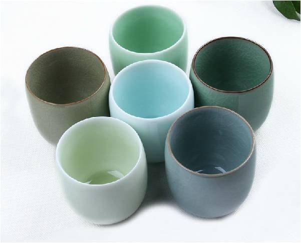
When I win the lottery and build my dream home, the interior is going to be in various shades of celadon - mellow greens and blues. Lighter greens for the sunny public rooms, deeper and bluer tones for bedrooms, jade greens for bathrooms.
| by Anonymous | reply 143 | July 7, 2017 12:05 AM
|
R143, I love your taste. Blues and greens are my favorite colors.
| by Anonymous | reply 144 | July 7, 2017 12:05 AM
|
I have a lot in blue, too, R141.
| by Anonymous | reply 145 | July 7, 2017 12:06 AM
|
To all the beige and gray comments I'll add my mother's opinion. She'd studied interior design at Parsons School of Design and was considered quite talented there. She never pursued it professionally and eventually became a typical suburban housewife. She never commented on the interiors of friends or family member homes except once. Our next door neighbor had redecorated her living room with beige walls, a beige sofa, putty coloured chairs and throw pillows in drab shades of moss green, rust, and faded mustard. My mother politely visited the house for a tour of the newly refreshed living room.
When she came home all she said was, "menopause colours" and slightly rolled her eyes. She herself was on the verge of menopause, so I wordlessly accepted the fact that there was some forever inaccessible to me but righteous wisdom to be had in those two words.
| by Anonymous | reply 146 | July 7, 2017 12:16 AM
|
R115. I had the exact opposite thing (I am R106 BTW). The house i bought has WHITE bathrooms, each in a style i call "mental hospital": white tub, white tiles, everything was white and slightly creepy. I ended up replacing all the tiles with color, painted the walls in color, and kept the white sink for contrast.
| by Anonymous | reply 147 | July 7, 2017 1:56 AM
|
R101 I've added the book to my Amazon list! Thanks for the recommendation.
| by Anonymous | reply 149 | July 7, 2017 2:01 AM
|
OK, I've just read that my home looks like a Mexican restaurant (Ole!). I don't care. I'm happy to live with my choices. Here's my emerald green bathroom (right after the new tile was added). BTW, my house is really tiny. The new tile was to accommodate a shower in the bathtub (which I didn't previously have) and the contractors had to add a circular shower ring so that I could keep water from hitting the windowsill.
| by Anonymous | reply 150 | July 7, 2017 2:04 AM
|
R148 Nope. Not posting pics of my place dear. My apologies but it is private and posting your place on the DL is like troll bait. I will tell you which colors we used: (all Sherwin Williams colors) Guest bathroom: Rockweed (2735) and Rainstorm (6230) with wood grain tiles on the wall and on the floor. Master bathroom: Online gray (7072) and Rainstorm (6230) with light stone tiles on floor and shower stall (we ripped out the tub).
| by Anonymous | reply 151 | July 7, 2017 2:08 AM
|
[quote][R148] Nope. Not posting pics of my place dear.
Gur' , I posted mine. People were only nice. They CAN be, you know
| by Anonymous | reply 152 | July 7, 2017 2:10 AM
|
[quote]we ripped out the tub
No tub in the whole house? I'd never do that. But I'm English.
| by Anonymous | reply 153 | July 7, 2017 2:12 AM
|
The Tiffany (Robin's egg) blue in the living room gets greener when the sun is at an angle. I love it when the colors change as the days go by.
| by Anonymous | reply 154 | July 7, 2017 2:24 AM
|
The tile job is nice and the color. Now Why did you tile up high in the corner with the window, but bring the plaster down by the bath??
| by Anonymous | reply 155 | July 7, 2017 2:29 AM
|
Or does the bath stretch along under the window?
| by Anonymous | reply 156 | July 7, 2017 2:30 AM
|
Yes, I agree - it also looks like a very nice house, R154.
I love that there's a door to the staircase.
& the stairs, wood and white.
| by Anonymous | reply 158 | July 7, 2017 2:36 AM
|
& the painted borders on the wooden floor, so stylish.
| by Anonymous | reply 159 | July 7, 2017 2:38 AM
|
Baroque color! Check out the inlaid marble floor at the Sala Gasparini in Madrid's Royal Palace. (Frankly, with that floor I would have gone with all white walls and ceilings.)
| by Anonymous | reply 160 | July 7, 2017 2:40 AM
|
R155, I'm afraid that might be a bit of an optical illusion (or just bad photography on my part). The extended tile goes out a few inches from the rim of the bathtub. My parents had remodeled back in the 70s, and at that time, they were told they'd have to choose between shutting off the window, or no shower. I couldn't bear to shut off the window (the original architecture), so I really struggled for a workaround to allow me to finally have a shower in the bathroom. The bath extends from wall to wall (yep, tiny). Up till then, I will share (with much shame) that I previously showered over a cesspool in the basement. Here's a photo before the contractors covered over the faux (plaster) tile with real tile.
r158, R159, Thanks! And R159, those aren't painted borders. They're actually walnut borders, in a French knot pattern. My Mom picked out this house (and my Dad signed the mortgage back)in 1963. My earliest memory is seeing my Mom cry (for the first time) over Kennedy's assissination, as my older brother and I sat at the coffee table with our coloring books.
| by Anonymous | reply 161 | July 7, 2017 2:46 AM
|
It was nice but the bathroom looks a little scary
| by Anonymous | reply 162 | July 7, 2017 2:48 AM
|
R162, It was before, but I assure you, it's perfectly wholesome now. That short period before the remodeling begins until the final result is pretty grueling.
| by Anonymous | reply 163 | July 7, 2017 2:50 AM
|
So, you've inherited the house you grew up in?
| by Anonymous | reply 165 | July 7, 2017 2:54 AM
|
I like the tiles on the bathroom floor. Hope you keep them.
| by Anonymous | reply 166 | July 7, 2017 2:58 AM
|
DV looks like a Pez dispenser in R79's picture.
The best colour at R30 is the blue eyes.
| by Anonymous | reply 167 | July 7, 2017 3:05 AM
|
R165, No, I moved back in to take care of my parents when their health started to go downhill. But I had to "buy out" my brother and sister from my Dad's estate after he died. My parents would have left me the house, free and clear, out of gratitude for my help. But, at the time, I was too resentful of the responsibility to consider living there once they were gone. When people die, your perspective changes. When I was trying to empty the house, I could only offer certain things to people I knew my Mom would have liked. So her old French lace napkin place settings went to a lovely woman I work with. My Mom's old collected china to another lovely friend. Every person who came by the house told me how beautiful the house was, and they all liked my Mom's taste (very 50s pink and grey). Their comments caused me to rethink my own opinions. I realized that my Mom's taste was different from mine, but she definitely "had an eye". It was hard, but I now call the house 'my house', instead of 'our house', which I did for years after losing my parents (2013).
R166,k Yes, the tiles stayed, and my contractors were so grateful. They're embedded in a concrete floor. When I discussed the remodeling options with my contractors, they were so grateful I wasn't planning on replacing the tile or the cast-iron bathtub. Either one of those would have pumped up the price considerably, and wouldn't be easy to replace.
| by Anonymous | reply 168 | July 7, 2017 3:07 AM
|
I love those tiles. How they look and how they feel underfeet.
I think they're pretty much classic American.
What's the age of the house?
| by Anonymous | reply 169 | July 7, 2017 3:18 AM
|
in this photograph you see them going all the way up the wall.
| by Anonymous | reply 170 | July 7, 2017 3:24 AM
|
R169, My house was built in 1926. Before the Great Depression. I've learned to watch time-lines pretty carefully. One of the things that always surprises me is that my relatives (at one time) lived in a mansion that used the same floor tiles. The things we think of as "luxe" weren't always 'luxe".
| by Anonymous | reply 171 | July 7, 2017 3:25 AM
|
They lived in THAT house?
Another thing I love, windows on staircases. But those are phenomenal.
| by Anonymous | reply 172 | July 7, 2017 3:28 AM
|
R172, Yes, They lived in THAT house, At that time, it was a funerary business ( what typically happens to old mansions in the US). So, as a child, i wandered over this huge mansion, with its wine cellars and chaffeur's quarters, and never dropped a thought.
| by Anonymous | reply 173 | July 7, 2017 3:34 AM
|
R153 We have a tub in the guest bath upstairs, but the tub in the master bath was replaced with a more modern shower with a glass partition.
| by Anonymous | reply 174 | July 7, 2017 3:39 AM
|
rR171, check out New York Social Diary's web page. Go to the House archives. There are a lot of articles marked Big Old House, about old estate houses, mostly Victorian or Edwardian, including pictures of kitchens and bathrooms. Both old pictures of the houses' interiors when they were new and modern color photos.
One thing that really struck me is that even very luxurious mansions had very similar bathrooms. They were usually all white, some marble, and almost all with the small octagonal tile shown upthread. Color bathrooms didn't come in until later. A lot of very fancy houses had simple white tile. If you look at those bathrooms today, other than the plumbing being somewhat old fashioned, they are timeless.
| by Anonymous | reply 175 | July 7, 2017 11:08 AM
|
Old houses with an extra back staircase are cool, too.
| by Anonymous | reply 176 | July 7, 2017 11:52 AM
|
cool house, R171. I couldn't get the link at R171 to open.
| by Anonymous | reply 177 | July 7, 2017 11:57 AM
|
I love all the W&Ws I'm getting for my post @ R170.
& I know why.
I love DL SO MUCH sometimes.
| by Anonymous | reply 178 | July 7, 2017 1:06 PM
|