Worst movie posters
There was a thread about your favorite movie posters a while ago but now let's talk about awful movie posters.
I hate the poster for "The Name of the Rose" with Sean Connery. The movie is a dark medieval mystery story, yet the poster makes it look like it's a Nancy Drew film or a Clue-type whodunit spoof.
| by Anonymous | reply 32 | May 26, 2018 4:13 AM
|
How in the name of all that is fucked can you people get so stuck in an era? Does the world completely pass you by at this point?
| by Anonymous | reply 1 | April 21, 2014 3:49 PM
|
Sorry, R1, are movies not made anymore? Are we in the post-movie poster era?
| by Anonymous | reply 2 | April 21, 2014 3:50 PM
|
Talk about bringing a bizarre agenda to the thread, r1.
Fucking unclench.
| by Anonymous | reply 3 | April 21, 2014 3:51 PM
|
OP, that was the poster they had done by that great 70s movie poster artist Richard Amsel, and it recalls the posters he did for Murder on the Orient Express and Death on the Nile. You're right it has little to do with the actual flavor of the film, but it looks like they were trying to promote this as medieval Agatha Christie story.
| by Anonymous | reply 4 | April 21, 2014 3:54 PM
|
I agree, OP. The image should have been my anus.
| by Anonymous | reply 5 | April 21, 2014 4:20 PM
|
This movie poster was important R6???
| by Anonymous | reply 6 | April 21, 2014 4:57 PM
|
Girls, can we please get back on topic?
| by Anonymous | reply 7 | April 21, 2014 5:04 PM
|
R7 is a little confused about what this site is about.
| by Anonymous | reply 8 | April 21, 2014 5:04 PM
|
There is a style of poster that I find tiresome. It is the blown-up head shot of the star and the title, sometimes with a tagline. But there is no artwork, no real feel for what the movie is about, no creativity.
This seems to be the standard for many current movie posters.
| by Anonymous | reply 9 | April 21, 2014 5:12 PM
|
This is probably a DVD cover, not an original poster, but it's still awful. Check out the awful photoshop job on Sarah Jessica Parker's head.
| by Anonymous | reply 10 | April 21, 2014 5:25 PM
|
R1 really frightened me. Such randon venom.
| by Anonymous | reply 11 | April 21, 2014 5:28 PM
|
A friend of mine who works in independent film distribution says that today's movie posters are designed to look good as thumbnails. Gone are the days when they were designed to attract passers-by to old movie palaces. Now they're designed to catch your eye as you're surfing Netflix or Amazon. Hence the simplified graphics and forms. They've gone from artwork to clickbait.
| by Anonymous | reply 12 | April 21, 2014 5:30 PM
|
Recently the poster for PHILOMENA struck me as pretty bad. Looked like one from a bad May December romance.
| by Anonymous | reply 13 | April 21, 2014 5:33 PM
|
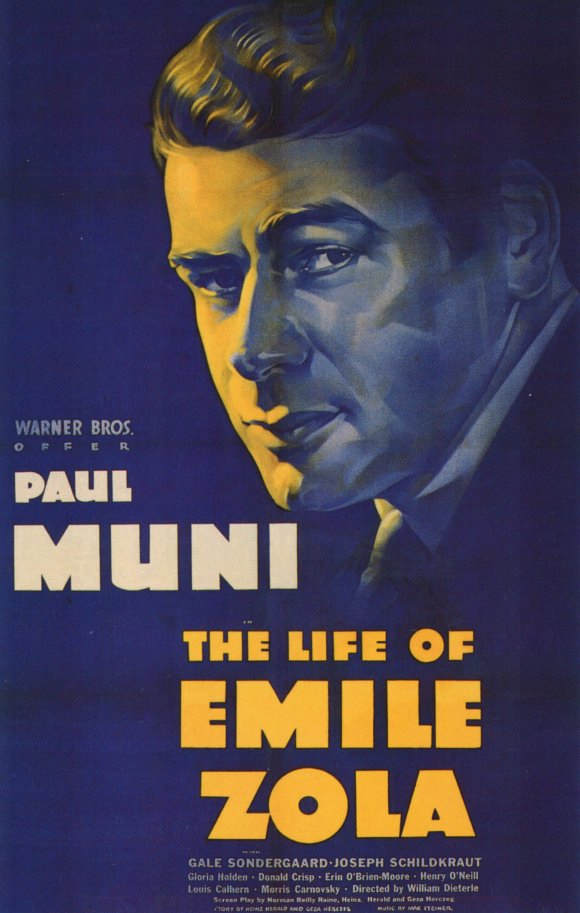
This is probably slightly off-topic, but I love the misleading movie posters from the 1930's. For instance, here's what Paul Muni looks like on the poster for The Life of Emile Zola:
| by Anonymous | reply 14 | April 21, 2014 5:36 PM
|
[quote] Recently the poster for PHILOMENA struck me as pretty bad. Looked like one from a bad May December romance.
I liked it.
| by Anonymous | reply 15 | April 21, 2014 5:36 PM
|
And here's how he actually looked in the movie. If something like this happened today some frau would probably file a false advertising lawsuit.
| by Anonymous | reply 16 | April 21, 2014 5:37 PM
|
This polish poster for Gone With The Wind is a hoot.
| by Anonymous | reply 17 | April 21, 2014 5:39 PM
|
[quote]This seems to be the standard for many current movie posters.
Like the poster for that current Johnny Depp film, about AI or robots or something - who know, the poster doesn't tell me anything. It's just a an excuse to show off Depp's giant face.
But I guess I understand now, like the previous poster said. These images are meant to be seen in small formats now.
Movie posters in the US are a dead artform. It's all character posters, bad puns, and 3 word tag lines. Nothing creative about any of it.
| by Anonymous | reply 18 | April 21, 2014 5:49 PM
|
Any poster where the cast is awkwardly splayed out like a full-house poker hand. Half these people have no legs, and look awkward.
| by Anonymous | reply 19 | April 21, 2014 7:33 PM
|
OP, I love Connery's sassy stance. haha
| by Anonymous | reply 20 | April 22, 2014 2:46 AM
|
"Recently the poster for PHILOMENA struck me as pretty bad. Looked like one from a bad May December romance."
You beat me to it. I thought the same thing.
| by Anonymous | reply 21 | April 22, 2014 2:51 AM
|
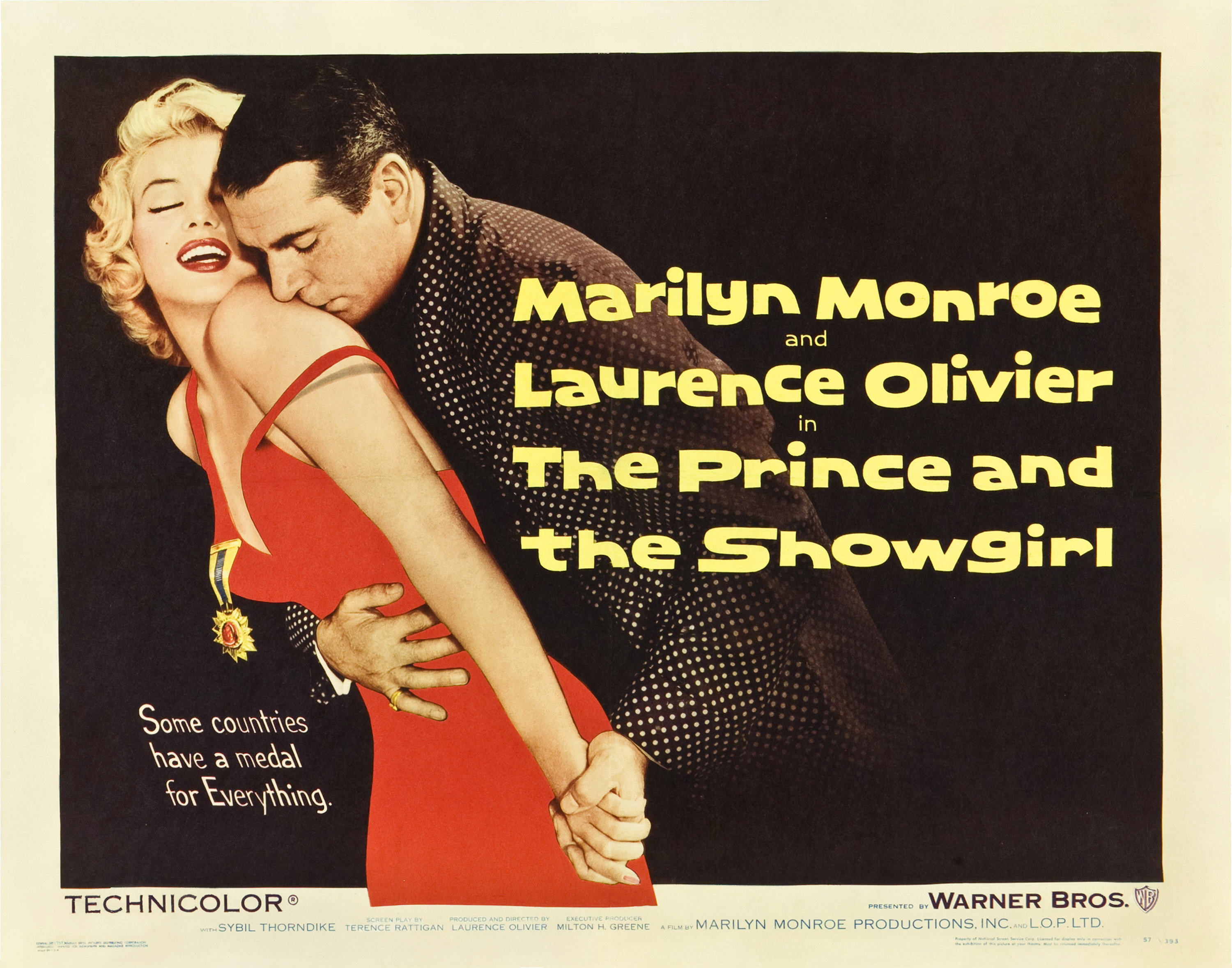
R20, THE PRINCE AND THE SHOWGIRL did something similar. The movie takes place in 1911 in anticipation of King George V's coronation, yet Marilyn and Olivier look very modern (well, modern for 1957). If I didn't know better, I would think that it was about a playboy prince who romances a Vegas showgirl, but the movie's nothing like that.
| by Anonymous | reply 22 | April 22, 2014 2:53 AM
|
I mean, fuck me, this is appalling. No surprise why this charming little movie was a surprise flop on initial release.
They eventually released a second poster featuring the other attractive cast members.
| by Anonymous | reply 23 | May 26, 2018 3:50 AM
|
As much as I loved the movie, I was never very fond of the poster.
| by Anonymous | reply 24 | May 26, 2018 4:11 AM
|